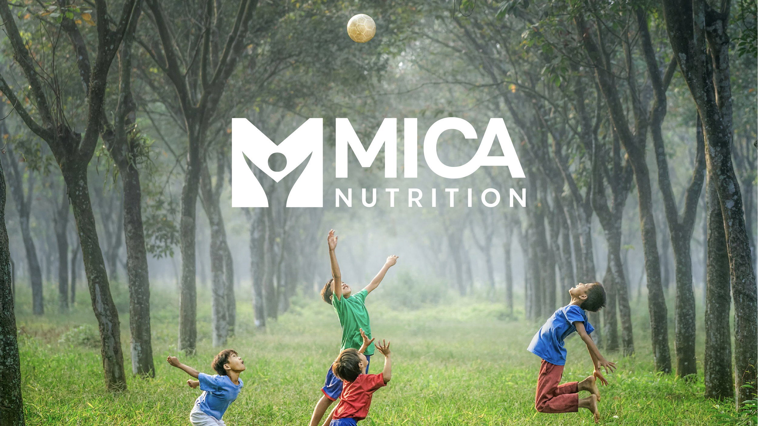
Mica Nutrition
SCOPE OF WORK:
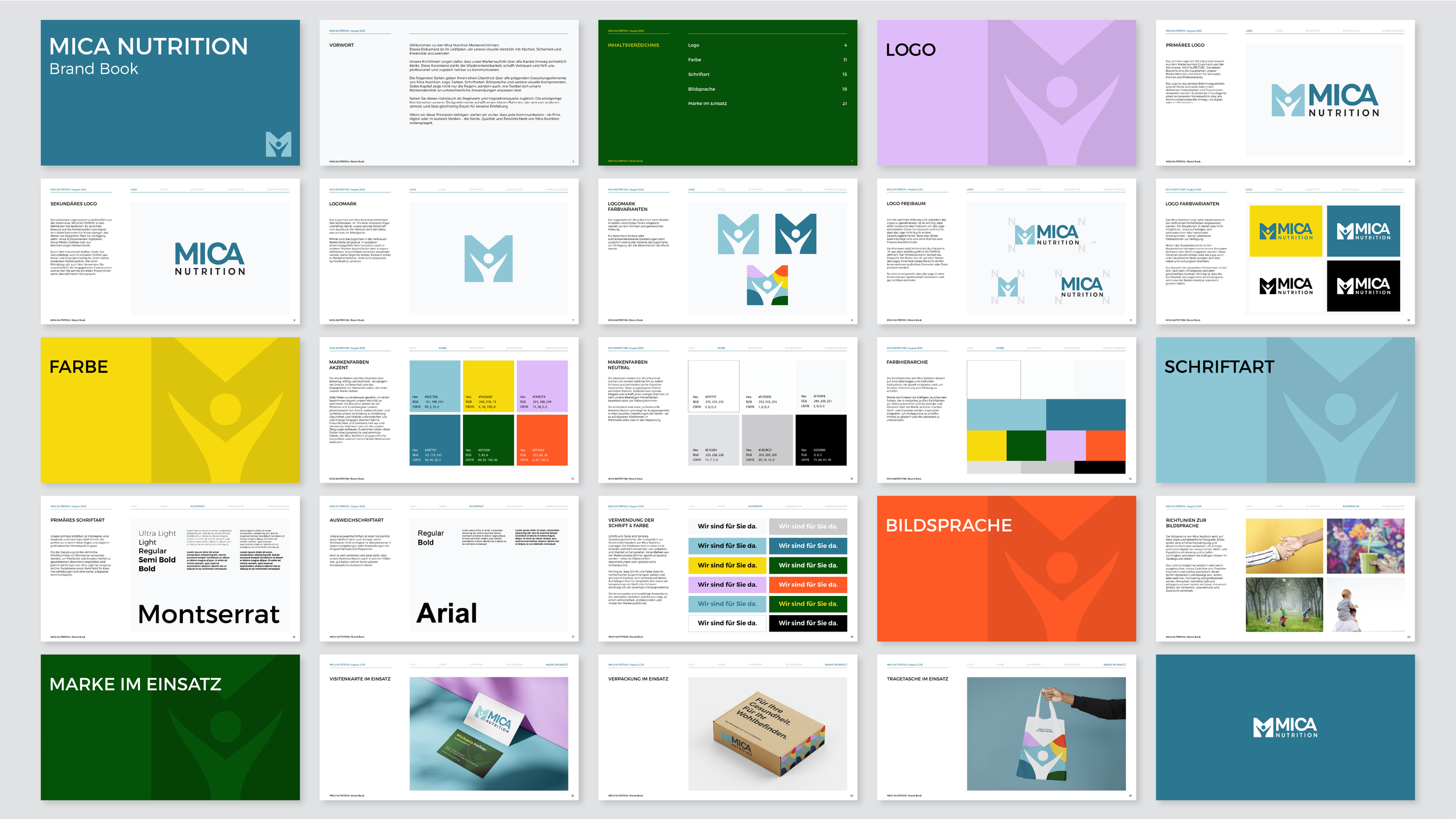
visual identity
VIBE:
optimistic, caring, knowledgeable, friendly
INDUSTRY:
pharma
Mica Nutrition is a community-focused nutrition and lifestyle platform supporting people living with PKU in Germany. The brand is rooted in an optimistic and caring mindset, with the goal of making complex nutritional information feel approachable, reassuring, and easy to navigate.
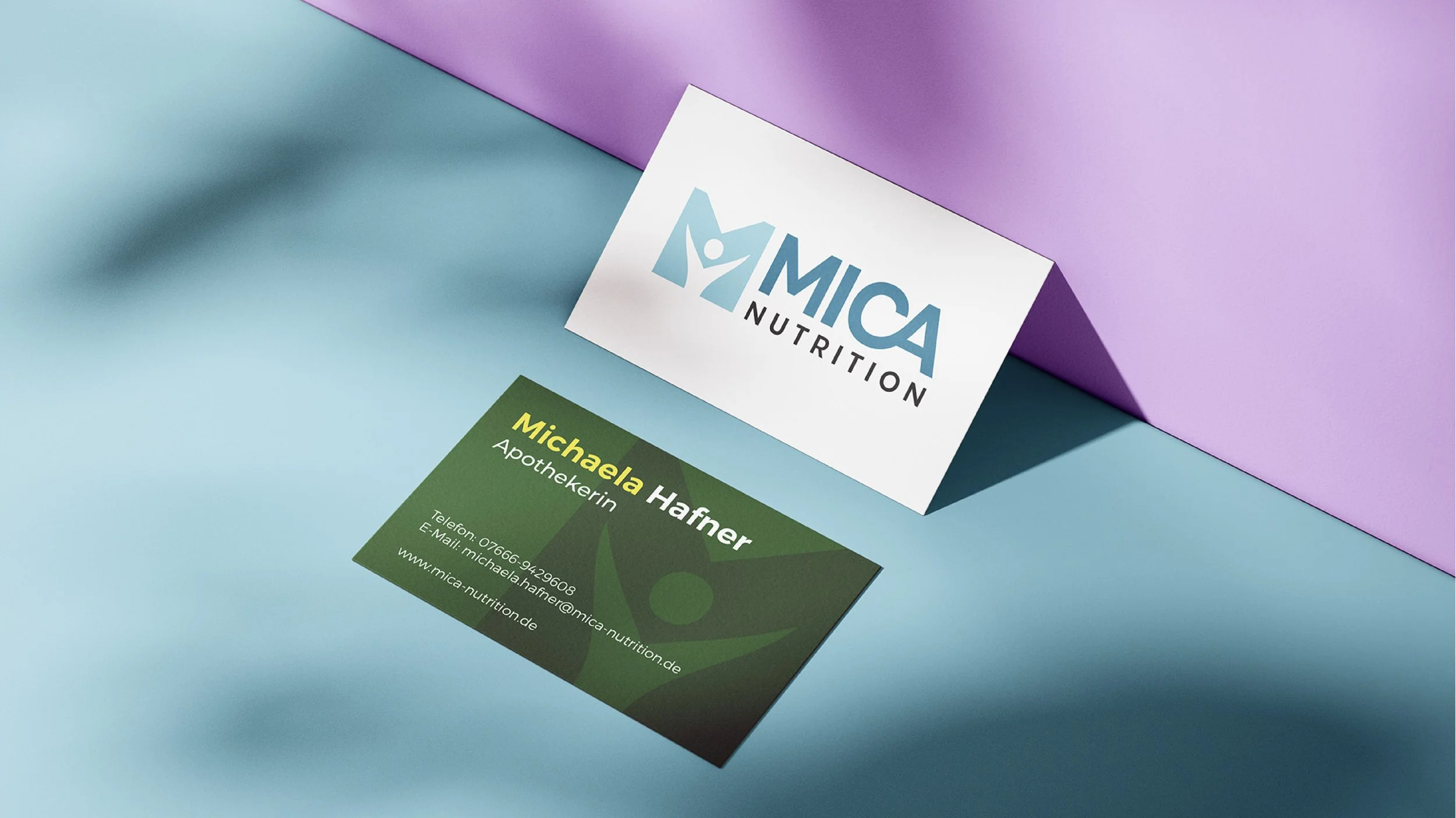
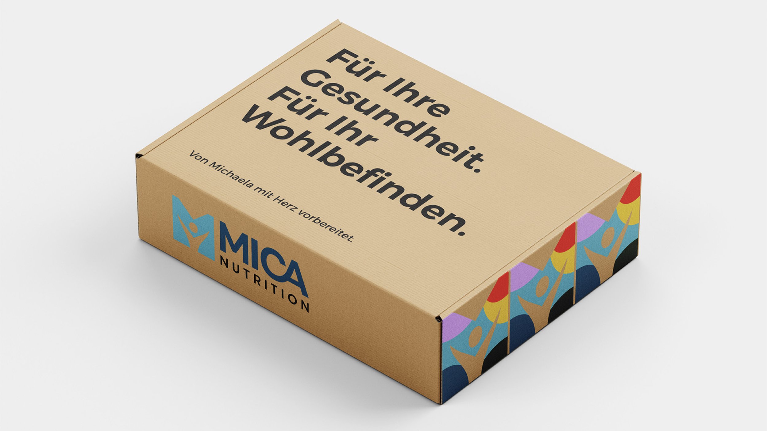
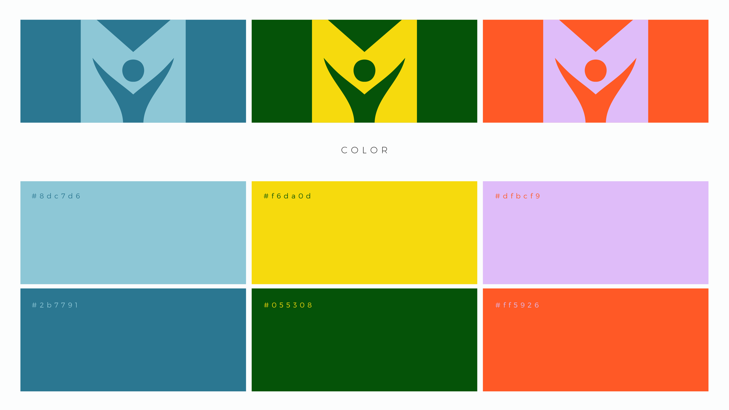
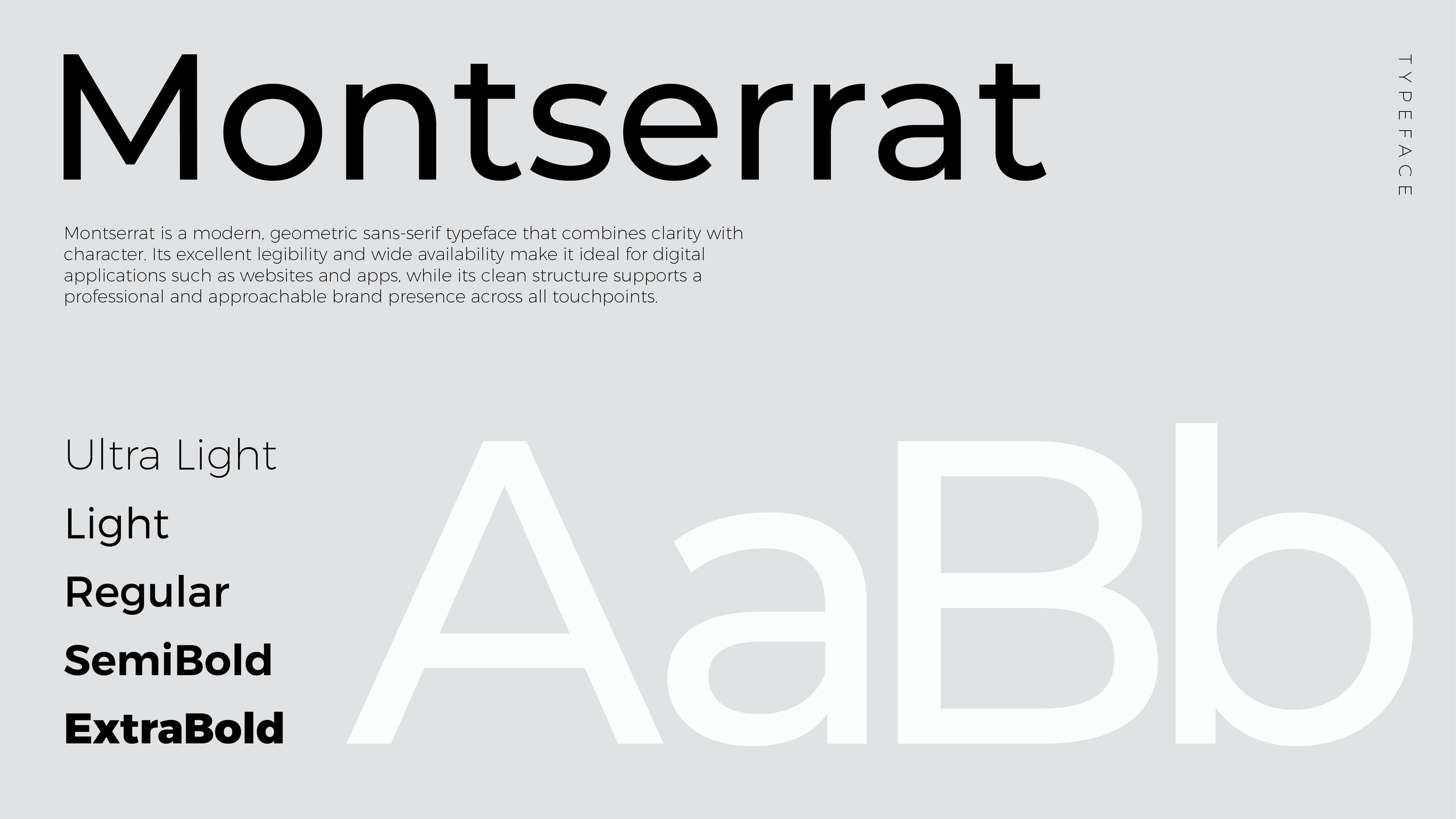
At its core, Mica Nutrition combines up-to-date scientific knowledge with a friendly, human tone — creating a space where users feel informed, supported, and safe. The visual identity reflects these values through a vibrant yet balanced color palette, clear typography, and a flexible design system that works across digital products, content, and communication.
The result is a modern, trustworthy brand that brings together expertise, community, and positivity — helping Mica Nutrition connect with its audience in a way that feels both professional and genuinely human.
CLIENT’S GOAL
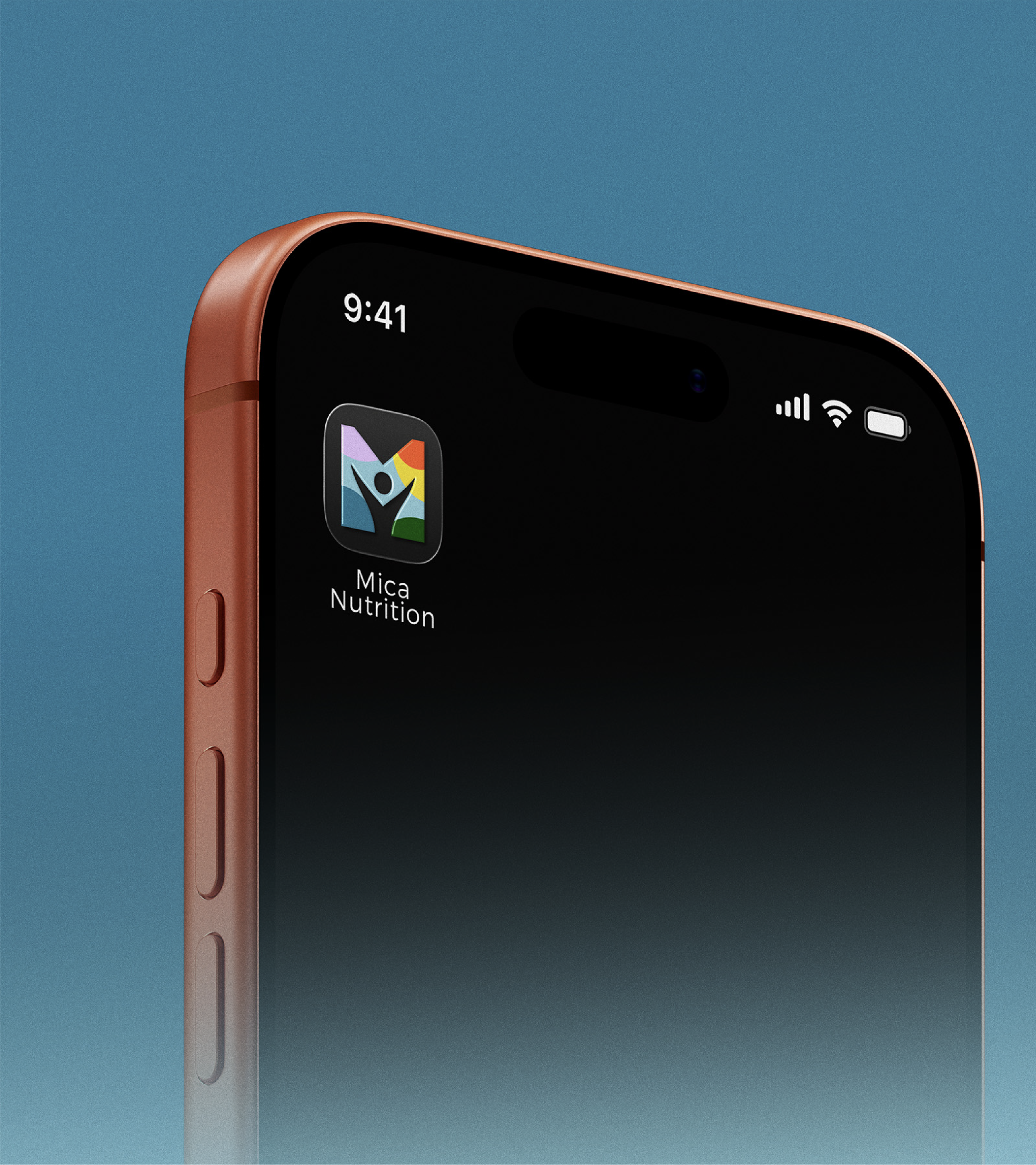
Mica Nutrition was preparing to launch a community-focused app and wanted to refresh its brand to feel more human, approachable, and modern. A key focus of the rebrand was creating a distinctive icon that represents both the brand name and the people at its center.

DESIGN NOTES
The visual identity was designed to feel optimistic, caring, and accessible, balancing medical credibility with warmth. A vibrant color palette and clear typography were developed to support digital use while keeping people and community at the center of the brand.